A beautiful game deserves beautiful jerseys
Once every four years, the world seems to stop and unify for a monthlong tournament. This year, the biggest single-sport competition in the globe is being battled out in Qatar until 18 December 2022; all eyes will be on the World Cup—over three billion to be exact. It’s no wonder we call it the world’s game. To match the spirit, drive, and greatness of the beautiful game, there will be some gorgeous kits to boot. Keep an eye out for these five handsome kits that will grace the pitch.

South Korea’s away kit
South Korea comes barging in with a riot of colours in their away kit. Like an abstract painting on canvas, the whimsical splash of red, blue and yellow brushstrokes when set against a black background further accentuates the dramatic visuals—making it the most striking kit in this year’s catalogue of jerseys. The blue and red in particular can be surmised as an homage to Taegeuk, the red-blue disk found in the centre of the South Korean flag which signifies either great polarity or duality. We’ll leave the yellow up to your interpretation.

Germany’s home kit
Inspired by Germany’s very first football kit from 1908 (and not everyone’s favourite alien-mutating 10-year-old from Cartoon Network), the unfussy combination of black and white is a tough one to beat, and Germany certainly understands that. The thick black strip going down the middle of the jersey encloses the Adidas logo, jersey number and club badge, which sits proudly on the player’s chest.


Japan’s home and away kit
Japan is no stranger to Qatar. In 1994, Japan was seconds away from qualifying for the World Cup for the first time in Doha, but when Iraq scored a last minute goal in stoppage time, it led to their elimination from the tournament. The loss was etched so deeply in the mind of Japanese supporters that they still refer to that day as “The Agony of Doha”.
Both of Japan’s kits in 2022 incorporate the concept of origami, where the act of folding a paper several times symbolises the highs and lows. It serves as a heartfelt reminder that success ebbs and flows, that their past disappointment at Doha will not dictate their fate at the same venue this year. The game against Germany said a lot.

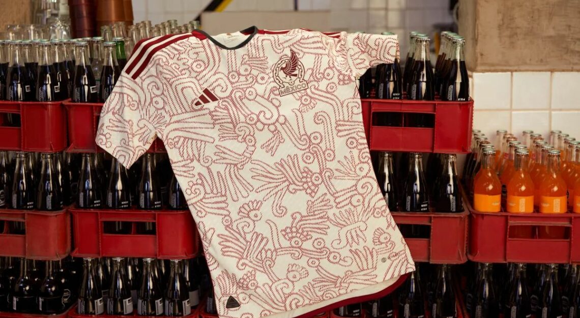
Mexico’s away kit
Mexico just seems to get it right every time, and this year is no exception. Their 2022 away kit looks beautiful with the off-white working exceptionally well with the intricate deep red graphics coursing throughout the jersey. Inspired by the Aztec deity Quetzalcoatl, the kit features five special symbols that pay tribute to the ancient civilisations rooted in Mexican history to rally the team’s fighting spirit where they seek to make history at this year’s tournament.
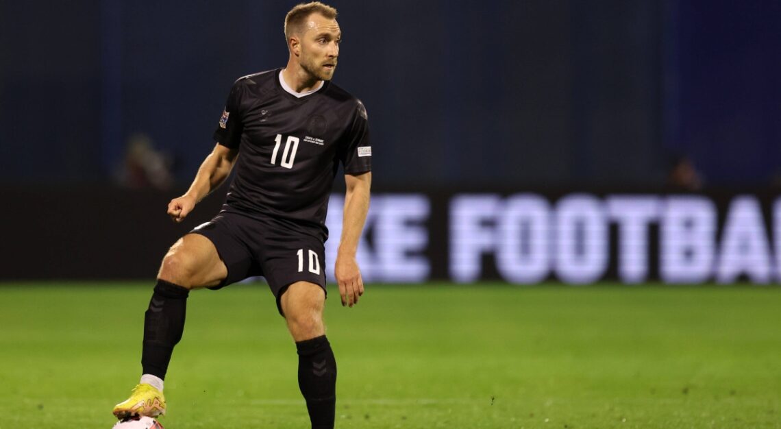

Denmark’s third kit
Denmark is protesting against the host nation Qatar’s human rights record and labour practices. All the branding, accents, and even club logo on their jerseys are intentionally toned down and made to be indiscernible. Hummel, the kit supplier for Denmark announced that they don’t wish to be visible during a tournament that has cost thousands of people their lives. The third all-black jersey was designed to honour the migrant workers that have died building Qatar’s World Cup stadiums, as well as the families left behind.
There has been plenty of backlash to Hummel’s stance, citing that Denmark should have withdrawn from the World Cup altogether if they believed in the idea so much; that by participating they are perpetuating the problem as collaborators. However, it doesn’t change the fact that this controversy has fuelled the message they are trying to convey, and it’s being heard loud and clear across the globe.
Ironically, these inconspicuous kits stand out the most, and besides, they look pretty damn good, too.